
效果演示
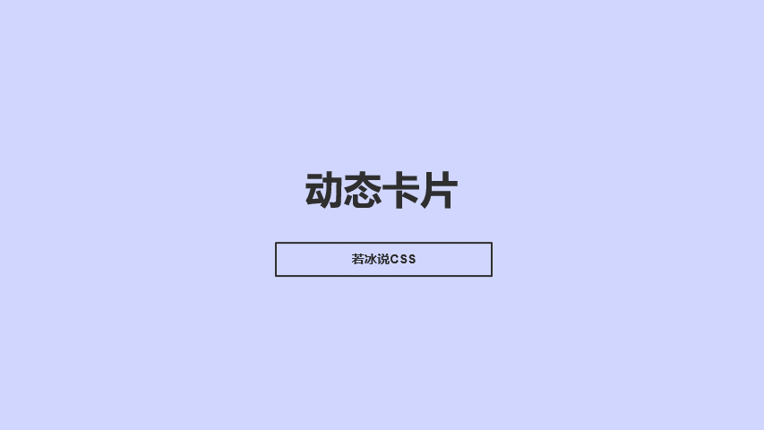
实现了一个带有动态阴影效果的卡片展示效果,包括卡片容器、图标、标题、内容和按钮的样式,以及鼠标悬停时的样式变化。
Code
HTML
<!DOCTYPE html>
<html lang="en">

  <head>
    <meta charset="UTF-8">
    <meta name="viewport" content="width=device-width, initial-scale=1.0">
    <title>动态卡片</title>
    <link rel="stylesheet" href="./51-动态卡片.css">
  </head>

  <body>
    <div class="container">
      <div class="box">
        <div class="icon">01</div>
        <div class="content">
          <h3>学习 HTML</h3>
          <p>把学习当成一种生活习惯。</p>
          <p>努力造就实力,态度决定高度。</p>
          <p>不经一翻彻骨寒,怎得梅花扑鼻香~</p>
          <a href="#">动手试一试</a>
        </div>
      </div>

      <div class="box">
        <div class="icon">02</div>
        <div class="content">
          <h3>学习 CSS</h3>
          <p>把学习当成一种生活习惯。</p>
          <p>努力造就实力,态度决定高度。</p>
          <p>不经一翻彻骨寒,怎得梅花扑鼻香~</p>
          <a href="#">动手试一试</a>
        </div>
      </div>
    </div>
  </body>

</html>
CSS
* {
    margin: 0;
    padding: 0;
}

.container {
    min-height: 100vh;
    display: flex;
    justify-content: center;
    align-items: center;
}

.box {
    position: relative;
    width: 350px;
    padding: 40px;
    background-color: #fff;
    box-sizing: border-box;
    box-shadow: 0 5px 15px rgba(0, 0, 0, .1);
    border-radius: 8px;
    text-align: center;
    margin-right: 50px;
    overflow: hidden;
    cursor: pointer;
}

.box .icon {
    width: 80px;
    height: 80px;
    color: #fff;
    background-color: #000;
    border-radius: 50%;
    font-size: 40px;
    line-height: 80px;
    margin: 0 auto;
    transition: all .5s;
}

.box:nth-child(1) .icon {
    box-shadow: 0 0 0 0 #e91e63;
    background: #e91e63;
}

.box:nth-child(2) .icon {
    box-shadow: 0 0 0 0 #2196f3;
    background: #2196f3;
}

.box:nth-child(1):hover .icon {
    box-shadow: 0 0 0 400px #e91e63;
}

.box:nth-child(2):hover .icon {
    box-shadow: 0 0 0 400px #2196f3;
}

.box .content h3 {
    font-size: 20px;
    margin: 10px 0;
}

.box .content p {
    line-height: 25px;
}

.box a {
    display: inline-block;
    padding: 10px 20px;
    background-color: #fff;
    box-shadow: 0 2px 5px rgba(0, 0, 0, .2);

    color: #000;
    text-decoration: none;

    border-radius: 4px;
    font-weight: 500;
    margin-top: 20px;
    cursor: pointer;
}


.box .content {
    transition: all .5s;
}

.box:hover .content {
    color: #fff;
}

.box::before {
    content: '';
    width: 50%;
    height: 100%;
    position: absolute;
    left: 0;
    top: 0;
    background-color: rgba(255, 255, 255, .2);
    z-index: 2;
}

.box .content a {
    position: relative;
    z-index: 3;
}
实现思路拆分
* {
  margin: 0;
  padding: 0;
}
设置所有元素的外边距和内边距为0。
.container {
  min-height: 100vh;
  display: flex;
  justify-content: center;
  align-items: center;
}
设置容器的最小高度为100vh,采用flex布局,水平和垂直居中。
.box {
  position: relative;
  width: 350px;
  padding: 40px;
  background-color: #fff;
  box-sizing: border-box;
  box-shadow: 0 5px 15px rgba(0, 0, 0, .1);
  border-radius: 8px;
  text-align: center;
  margin-right: 50px;
  overflow: hidden;
  cursor:pointer;
}
设置卡片容器的样式,包括定位、宽度、内边距、背景颜色、盒模型、阴影、圆角、文本居中、右边距、溢出隐藏和鼠标指针样式。
.box .icon {
  width: 80px;
  height: 80px;
  color: #fff;
  background-color: #000;
  border-radius: 50%;
  font-size: 40px;
  line-height: 80px;
  margin: 0 auto;
  transition: all .5s;
}
设置卡片图标的样式,包括宽度、高度、字体颜色、背景颜色、圆角、字体大小、行高、水平居中、过渡效果。
.box:nth-child(1) .icon {
  box-shadow: 0 0 0 0 #e91e63;
  background: #e91e63;
}

.box:nth-child(2) .icon {
  box-shadow: 0 0 0 0 #2196f3;
  background: #2196f3;
}
设置第一个和第二个卡片图标的阴影和背景颜色。
.box:nth-child(1):hover .icon {
  box-shadow: 0 0 0 400px #e91e63;
}

.box:nth-child(2):hover .icon {
  box-shadow: 0 0 0 400px #2196f3;
}
设置鼠标悬停时第一个和第二个卡片图标的阴影变化。
.box .content h3 {
  font-size: 20px;
  margin: 10px 0;
}

.box .content p {
  line-height: 25px;
}

.box a {
  display: inline-block;
  padding: 10px 20px;
  background-color: #fff;
  box-shadow: 0 2px 5px rgba(0, 0, 0, .2);

  color: #000;
  text-decoration: none;

  border-radius: 4px;
  font-weight: 500;
  margin-top: 20px;
  cursor: pointer;
}
设置卡片标题、内容和按钮的样式,包括字体大小、上下边距、行高、内边距、背景颜色、阴影、字体颜色、文本装饰、圆角、字体加粗、上边距和鼠标指针样式。
.box .content {
  transition: all .5s;
}

.box:hover .content {
  color: #fff;
}
设置卡片内容的过渡效果和鼠标悬停时的样式变化。
.box::before {
  content: '';
  width: 50%;
  height: 100%;
  position: absolute;
  left: 0;
  top: 0;
  background-color: rgba(255, 255, 255, .2);
  z-index: 2;
}

.box .content a {
  position: relative;
  z-index: 3;
}
设置卡片容器的伪元素和按钮的层级。
THE END


匿名
2025-12-13
大大可以找下哈狗的1030吗,太想要那首歌了~谢谢!
匿名
2025-11-09
https://collaigo.com 免费在线拼图工具
匿名
2025-10-22
盖楼盖楼!
匿名
2025-08-11
沙发沙发
匿名
2025-08-10
https://at.oiik.cn/bing.html
匿名
2025-02-21
实用,我在开发https://minmail.app/时候使用到了